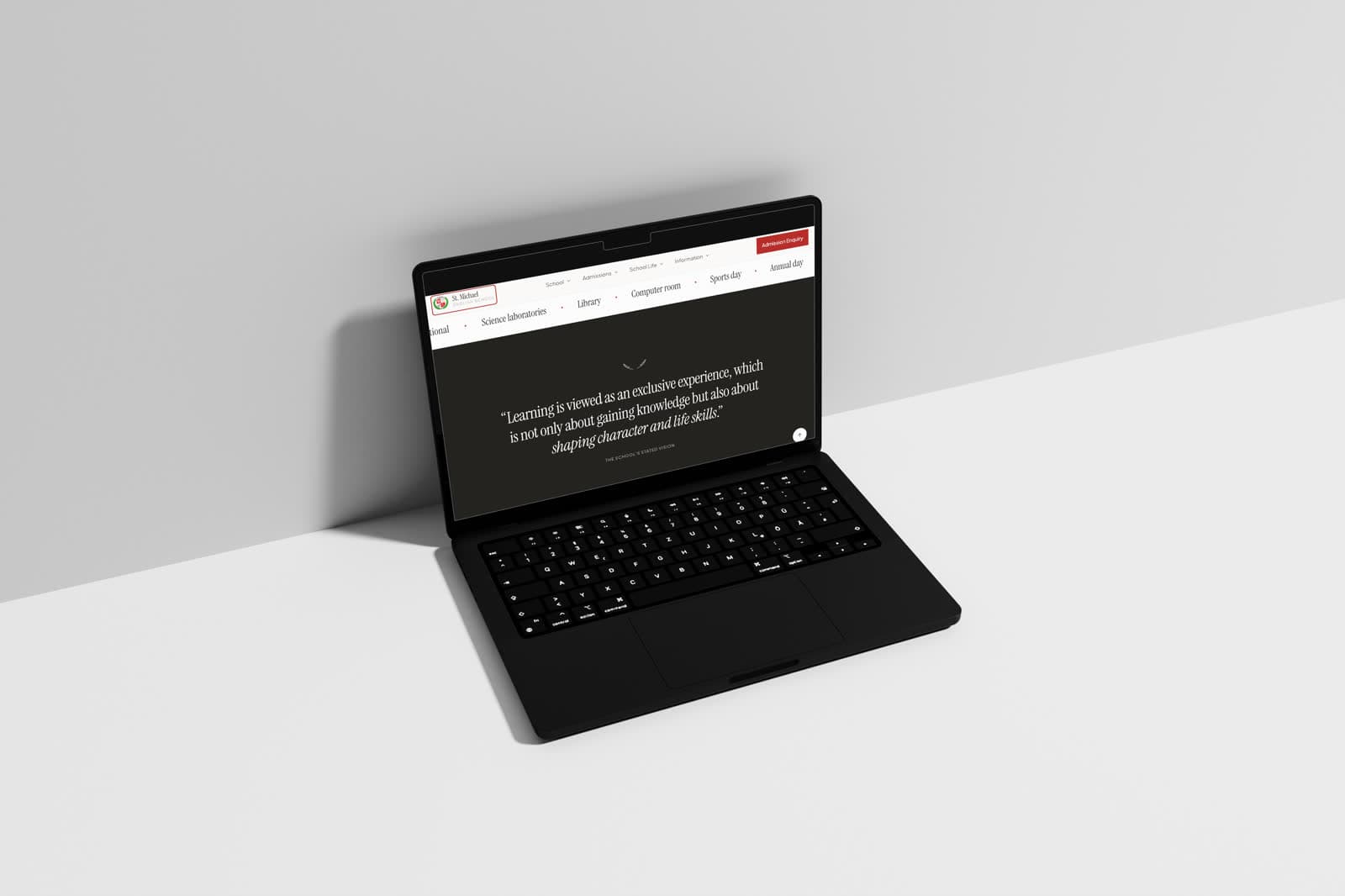
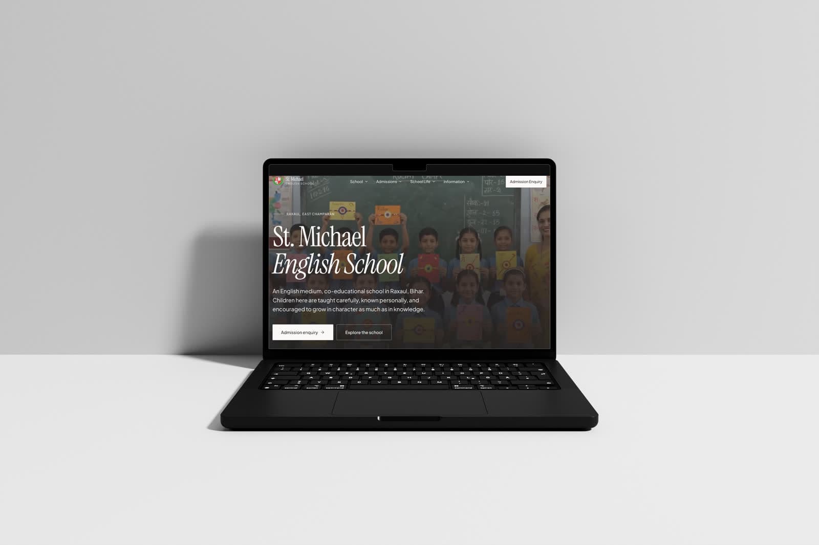
An English-medium, co-educational school in Raxaul, East Champaran, Bihar.
Role
Web design & build
Engagement
Self-initiated concept
Scope
- Information architecture
- Admissions enquiry flow
- Academics & faculty structure
- Performance-minded responsive build
Tools
- Figma — UI design
- WordPress
Disciplines
- Web design
- Information architecture
A school site built for the parent making an enquiry, not for the administration maintaining it. Admissions, academics and contact stay reachable from anywhere on the page, on the kind of connection and device families in Raxaul are actually using.
A self-initiated concept. The business is real; the engagement is not — this was designed to explore the brief, not delivered to a client.
Built around the admission enquiry.
Every other page on a school site exists to support one action: a parent deciding to get in touch. The structure follows the order a parent actually asks things — is this school right for my child, what does it cost, and how do I apply.
Institutional pages that serve the school rather than the enquiry are present but sit deliberately behind that path.
The audience is on a mid-range phone, not a laptop.
Most enquiries in this market arrive from a modest Android device on an inconsistent connection. A heavy, image-led institutional site simply does not open, and an enquiry that does not open is an enquiry lost.
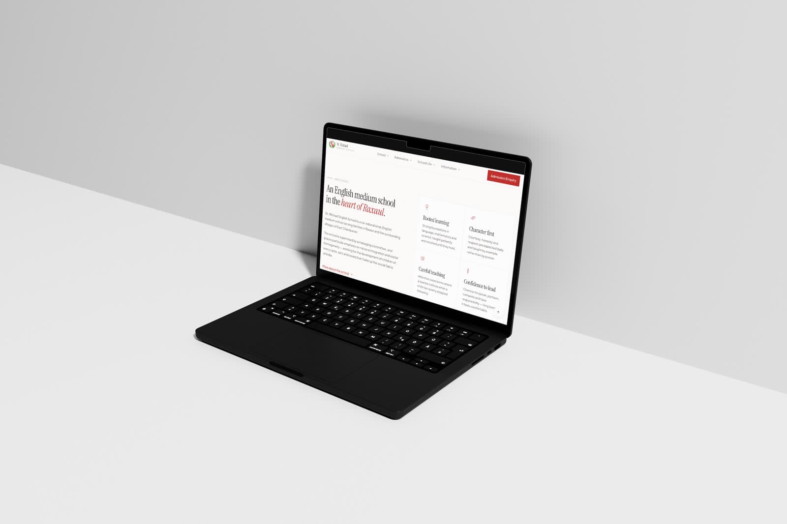
Serious, warm, and light to load.
Classical type gives the institution the formality parents expect, paired with photographs of actual classrooms and actual pupils rather than stock imagery, which in a small town is noticed immediately.
The page is kept deliberately light — restrained imagery, no heavy embeds — so it opens quickly on the devices the audience actually holds.
- Enquiry reachable from every screen
- Real classroom photography over stock
- Page weight treated as an accessibility concern
The visual system.
A traditional school palette handled with restraint: crimson reserved for emphasis, forest green for secondary sections, Instrument Serif for headings and Plus Jakarta Sans for text, with 2px corners that feel printed rather than app-like.
Colour names and values are the design tokens declared in the live site's CSS; type sizes, weights and button styles were measured from the rendered page at desktop width.
01 — Foundations
Colour, type and shape — the decisions every component inherits.
Brand
crimson
#8E1B18
Emphasis and accents
crimson-deep
#6B1412
Pressed states
crimson-tint
#FBF1EF
Tinted surfaces
forest
#14512F
Secondary sections
forest-tint
#EEF5F0
Tinted surfaces
Neutrals
ink
#14110F
Headings, dark hero
ink-soft
#4A4340
Body text
ink-faint
#8A817C
Secondary text
paper
#FCFAF7
Page
line
#E4DED5
Borders
Typography
Display
Instrument Serif
St. Michael English School
Text
Plus Jakarta Sans
An English medium, co-educational school.
Type scale
Corner radius
- Buttons2 px
- Small elements4 px
- Pills999 px
02 — Components
Rebuilt from the St. Michael English School screens and tokens — the parts every screen is assembled from.
Raxaul · East Champaran
St. Michael English School
An English medium, co-educational school in Raxaul, Bihar.
Type in use
Measured on the dark hero; buttons shown on the same ground.
Buttons
Primary and secondary actions exactly as styled on the live site.