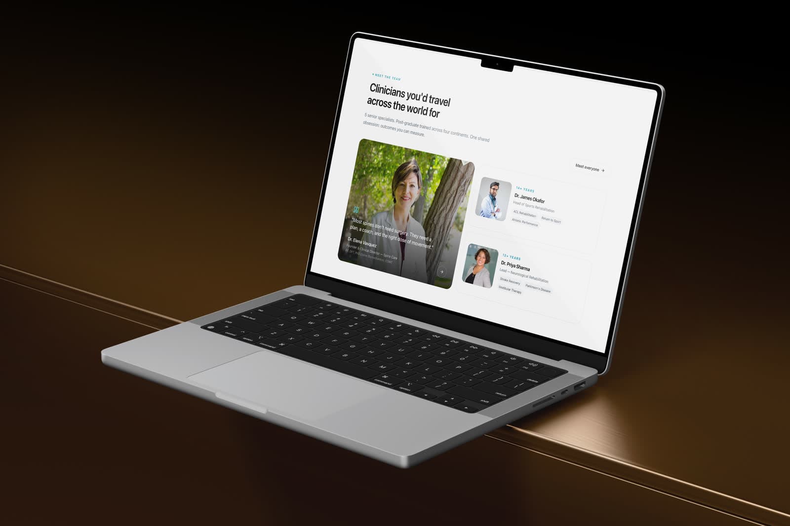
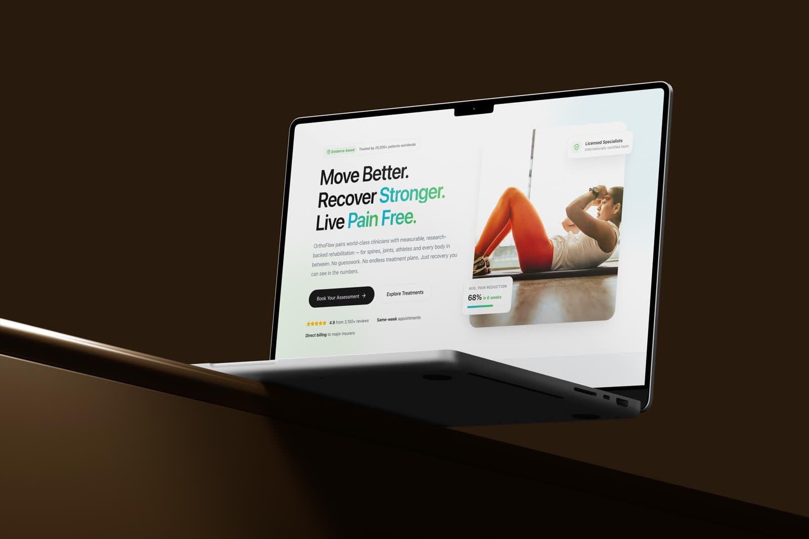
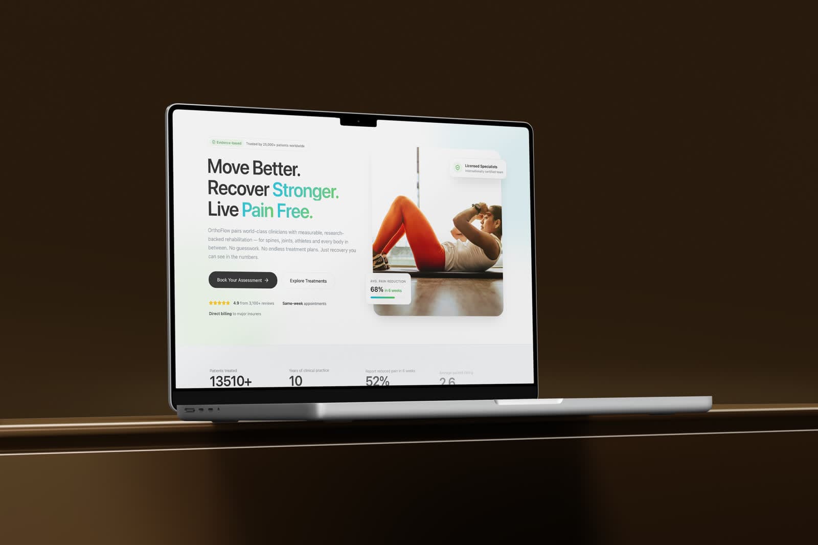
Evidence-based physiotherapy and spine care — same-week appointments and direct insurance.
Role
Web design & build
Engagement
Self-initiated concept
Scope
- Condition-led information architecture
- Booking flow
- Insurance & availability content
- Responsive build
Tools
- Figma — UI design
- Framer
Disciplines
- Web design
- Conversion design
Move better, recover stronger, live pain free. A clinic site built to turn an anxious search into a booked appointment, answering the two practical objections — how long will I wait, and will my insurance cover it — before they have a chance to stop anybody.
A self-initiated concept. The business is real; the engagement is not — this was designed to explore the brief, not delivered to a client.
From symptom to appointment.
People arrive at a physiotherapy site having searched a symptom, not a service. The architecture is therefore led by conditions treated, with the clinical detail behind each one, and booking attached to every single entry point.
Two objections stop most bookings.
Waiting time and insurance. Both are usually buried on a separate page, and both are the reason somebody closes the tab. Stating them early costs nothing and removes the friction entirely.
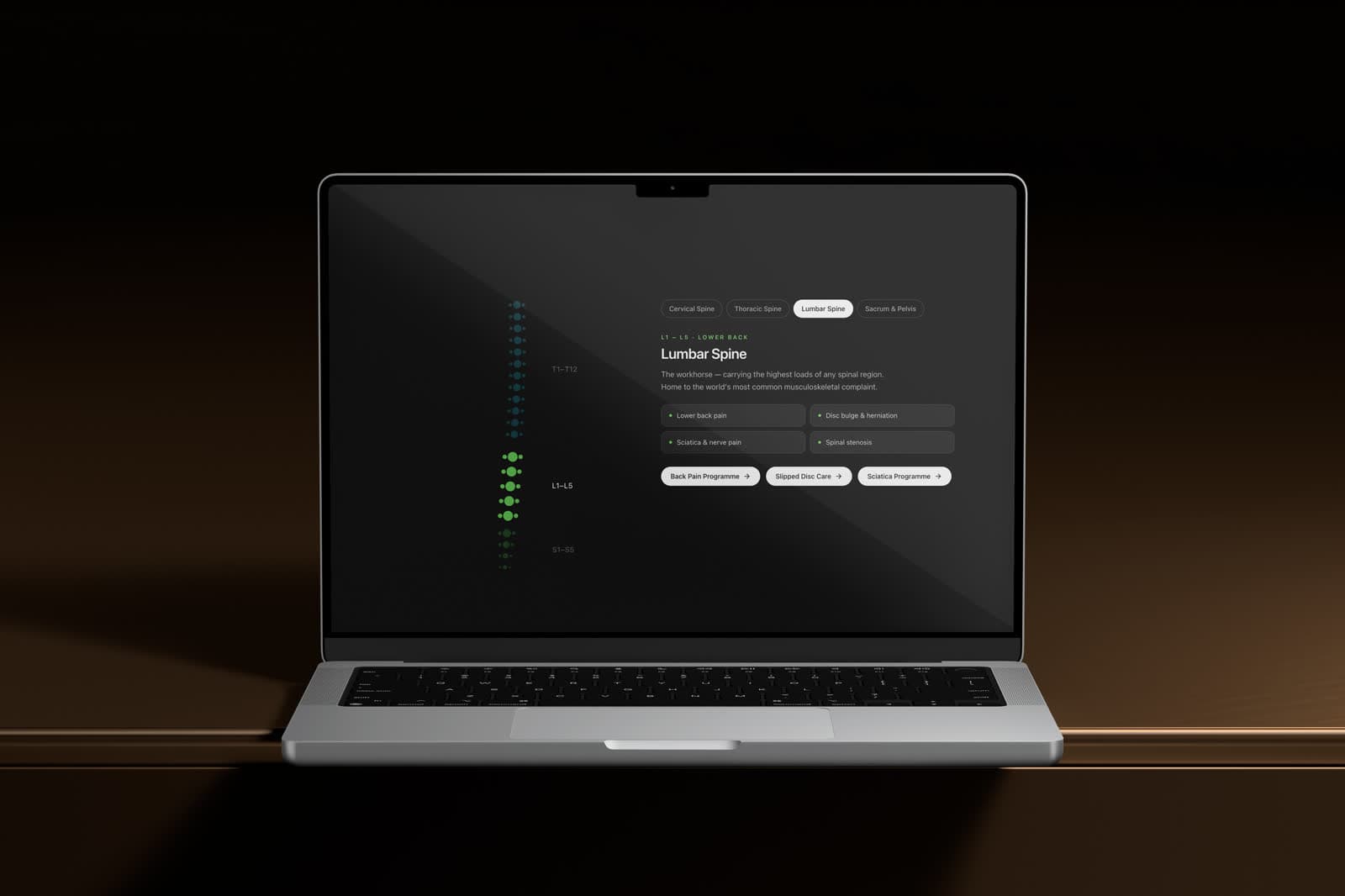
Clinical credibility without the coldness.
Clear type, generous spacing and a restrained accent give the clinic the authority the category needs, while photography of actual treatment — hands, movement, equipment in use — keeps it from reading as a hospital.
Availability and insurance status are surfaced in the opening screen rather than on a policies page.
- Conditions lead; services follow
- Waiting time and insurance answered up front
- Treatment photography over stock smiles
The visual system.
A clinical system without coldness: a full cyan brand scale and a soft leaf green for recovery, on white and a pale blue-grey, with near-black primary buttons so the booking action never blends into the brand colour.
Colour names and values are the design tokens declared in the live site's CSS; type sizes, weights and button styles were measured from the rendered page at desktop width.
01 — Foundations
Colour, type and shape — the decisions every component inherits.
Brand scale
brand-50
#E8FAFD
Tinted surfaces
brand-300
#5CD7EA
Illustration and highlights
brand-500
#00B7D8
Brand accent
brand-700
#077893
Accessible accent text
brand-900
#0E4F5C
Dark accents
Recovery & neutrals
leaf-100
#D8F5D3
Positive surfaces
leaf-300
#83DA79
Positive accents
Ink
#0D0D0D
Headings, primary buttons
Body
#45505A
Body text
Surface
#F6F8FA
Section backgrounds
Typography
Display
Plus Jakarta Sans
Move Better. Recover Stronger.
Declared as the display face in the site's CSS.
Text
Inter
Evidence-based physiotherapy and spine care.
Type scale
Corner radius
- Buttons & chips999 px
- Cards24 px
- Small cards16 px
02 — Components
Rebuilt from the OrthoFlow screens and tokens — the parts every screen is assembled from.
Physiotherapy & Spine Institute
Move Better. Recover Stronger.
Evidence-based physiotherapy and spine care, with same-week appointments.
Type in use
Display and text faces at their measured weights and tracking, on the site's own ground.
Buttons
Primary and secondary actions exactly as styled on the live site.