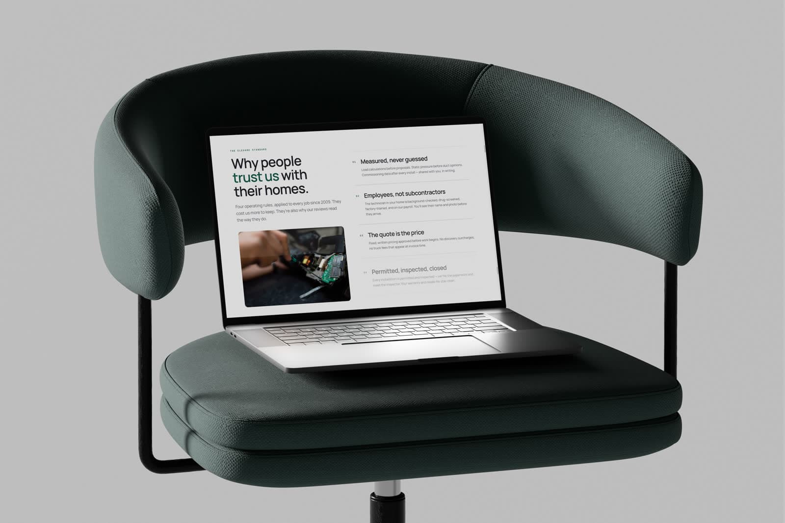
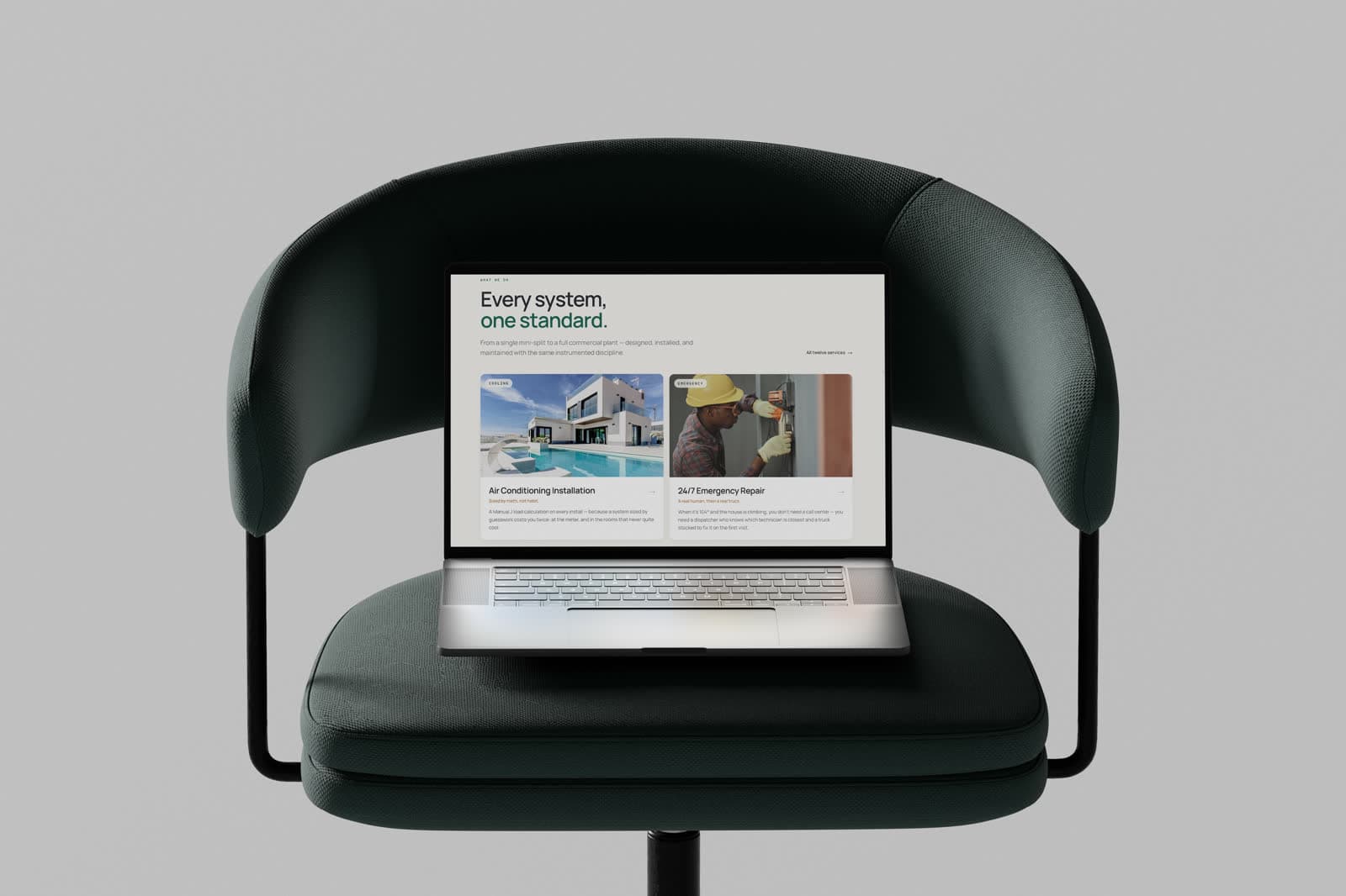
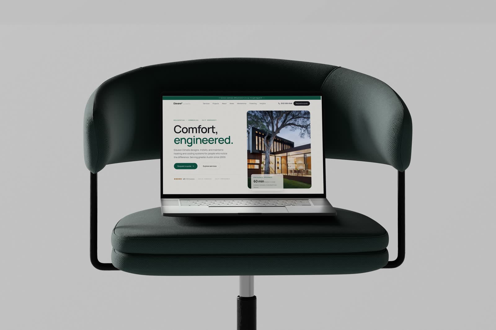
Premium residential and commercial HVAC in greater Austin — installation, 24/7 repair and maintenance.
Role
Web design & build
Engagement
Self-initiated concept
Scope
- Dual-intent page structure
- Emergency contact pattern
- Service & coverage area content
- Responsive build
Tools
- Figma — UI design
- Framer
Disciplines
- Web design
- Conversion design
A trades site that has to work in an emergency. Somebody whose air conditioning has failed in an Austin summer needs a phone number and a service area within seconds; everybody else needs to be persuaded that this company's work is worth paying more for. Both visitors land on the same page.
A self-initiated concept. The business is real; the engagement is not — this was designed to explore the brief, not delivered to a client.
Two visitors, one page.
The urgent visitor is in distress and scanning for a number. The considered visitor is planning an installation and comparing three companies on craft. Serving only the first produces a page that looks like a call-centre; serving only the second loses the emergency work that pays the bills.
The page is therefore ordered so the emergency path is permanently available at the top, and the persuasion runs underneath it for anybody who keeps scrolling.
Design-grade, for a trade that rarely gets it.
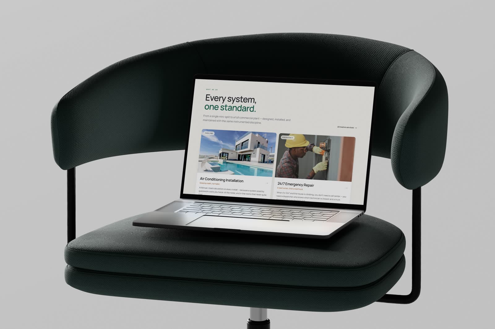
Restrained type and real project photography let a mechanical service read as a considered one. That gap is the actual differentiator: the equipment is broadly the same across competitors, so the perceived quality of the installation is what justifies the premium.
Coverage is stated as plain place names rather than a radius on a map, because that is how somebody checks whether a company will come to them.
- A call action that never scrolls out of reach
- Coverage stated in place names, not a radius
- Installation photography carrying the quality argument
The visual system.
A precision-engineering palette for a trade that rarely gets design attention: emerald for trust, copper as a warm counterpoint, Manrope in heavy, tightly tracked headlines, and IBM Plex Mono for technical labels.
Colour names and values are the design tokens declared in the live site's CSS; type sizes, weights and button styles were measured from the rendered page at desktop width.
01 — Foundations
Colour, type and shape — the decisions every component inherits.
Brand
emerald
#0F5847
Primary accent
emerald-deep
#0A4033
Pressed and dark bands
emerald-soft
#E2EBE6
Tinted surfaces
copper
#AD713D
Warm accent
copper-soft
#F0E6D9
Warm surfaces
Neutrals
ink
#191C21
Headings, primary buttons
mist
#62676E
Body text
deep
#0B0E12
Dark sections
paper
#F6F5F1
Page
line
#E2E0D8
Borders
Typography
Display & text
Manrope
Comfort, engineered.
Technical labels
IBM Plex Mono
24/7 REPAIR · AUSTIN, TX
Type scale
Corner radius
- Buttons999 px
- Cards16 px
- Small cards12 px
02 — Components
Rebuilt from the Elevare Climate screens and tokens — the parts every screen is assembled from.
Heating · Cooling · Air quality
Comfort, engineered.
Precision heating, cooling and air quality across greater Austin.
Type in use
Display and text faces at their measured weights and tracking, on the site's own ground.
Buttons
Primary and secondary actions exactly as styled on the live site.