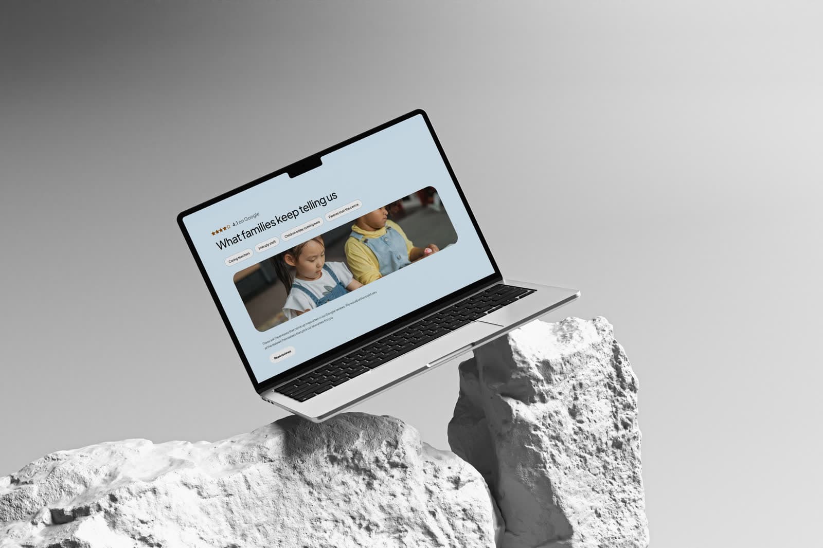
A licensed early-learning centre in Sage Hill, Calgary, for children six months to five years.
Role
Web design & build
Engagement
Self-initiated concept
Scope
- Programme & age-group structure
- Licensing and safety content
- Tour booking flow
- Responsive build
Tools
- Figma — UI design
- Framer
Disciplines
- Web design
- Content strategy
A day-care and early-learning site for parents deciding where to leave their child every morning. Licensing, programmes, staff and safety are the real questions; the design answers all of them without ever feeling institutional about it.
A self-initiated concept. The business is real; the engagement is not — this was designed to explore the brief, not delivered to a client.
The audience is the parent, even though the subject is the child.
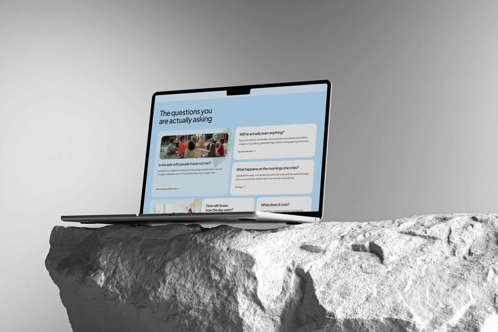
Programmes by age group, the shape of a typical day, the people who will actually be in the room, and how to arrange a visit — in that order, because that is the order a parent's questions arrive in.
Licensing status is stated plainly rather than buried in a footer. For this decision it is not fine print; it is the first filter.
Bright without being childish.
The palette is warm and confident rather than primary-coloured. Nursery clip-art signals a place designed for children; a considered visual system signals a place run by adults who are good at their jobs, which is what a parent is actually buying.
Photography shows children mid-activity rather than posed, and staff are shown by name — the two things that most reliably turn a shortlist into a booked tour.
- Licensing and ratios stated up front
- Staff shown by name and face
- Tour booking treated as the primary action
The visual system.
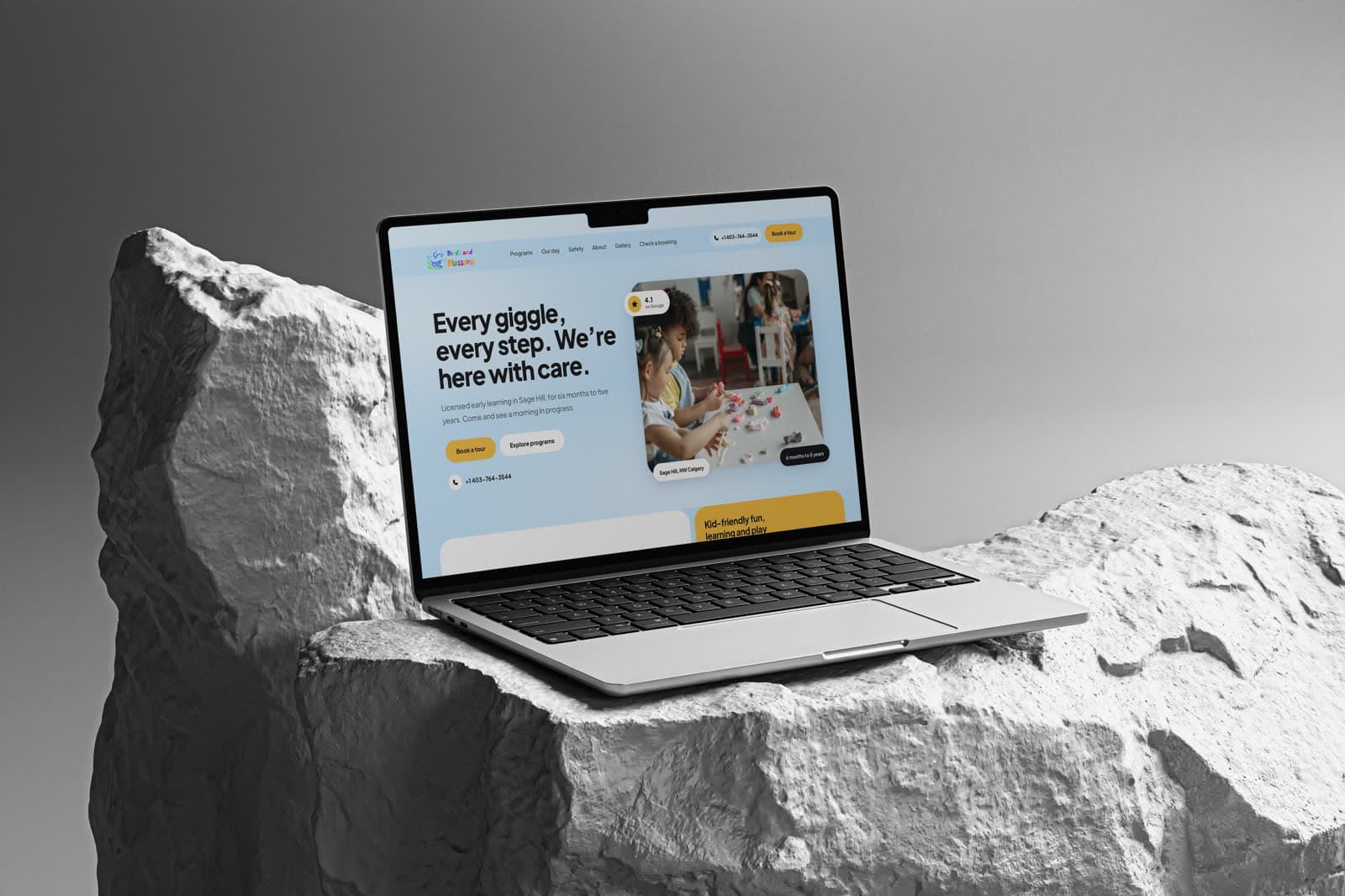
Bright without being childish: a sky-blue ground, a warm mustard for every call to action, and a heavy geometric sans set tight, with soft white pills carrying the reassurance parents look for — rating, age range, neighbourhood.
Derived from the project's own screens. Colours were sampled from the design renders; typefaces were identified from the screens, and each specimen is set in the closest open-source match. These renders sit in shaded mockups, so values were corrected against the site's white interface elements.
01 — Foundations
Colour, type and shape — the decisions every component inherits.
Palette
Sky
#D9F0FF
Page ground
Mustard
#FBC34E
Primary actions, feature cards
Ink
#111418
Headlines, dark badges
Slate
#546C7A
Body text
White
#FFFFFF
Cards, secondary pills
Typography
Display · extra bold
Geometric sans
Every giggle, every step.
Specimen set in Plus Jakarta Sans, the closest open match.
Text
Geometric sans
Licensed early learning in Sage Hill.
Same family at text weights.
02 — Components
Rebuilt from the Birds and Blossoms screens and tokens — the parts every screen is assembled from.
4.1 on Google · Sage Hill, NW Calgary
Every giggle, every step. We're here with care.
Licensed early learning in Sage Hill, for six months to five years.
Type in use
Display and text faces as they appear on the site, on its own ground.
Buttons
The mustard primary, a white secondary, and the dark pill used for facts laid over photographs.