One investing app for stocks, mutual funds, forex and crypto — structured so a new investor can see their money clearly before acting on it.
Role
Co-designer
Engagement
Self-initiated product case study
Team
Co-designed with Gurleen Kaur
Scope
- Problem definition & user personas
- Information architecture — five destinations
- Onboarding, portfolio and trading flows
- Data visualisation
- Design system — colour, type, components
- High-fidelity UI
Platform
Mobile app
Tools
- Figma — UI design
- Photoshop
- Illustrator
Disciplines
- Product design
- Information architecture
- Design system
Year
2026
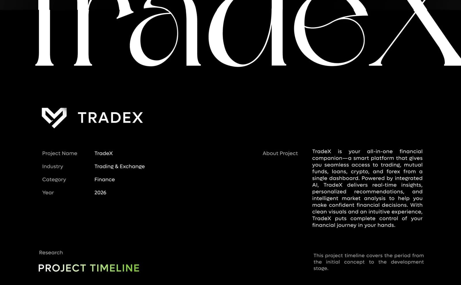
TradeX is a self-initiated product case study, co-designed with Gurleen Kaur. Research into how people manage their money kept returning to the same picture: separate apps for trading, mutual funds, loans, crypto and forex, and no single place to see the whole — a fragmentation that hits new investors hardest. TradeX brings those instruments into one product, one information architecture and one design system.
A self-initiated product case study, not a commissioned engagement. The product is explored in depth — problem, structure, interface and system — but it has not been launched commercially.
One financial life, spread across five apps.
Modern investors rely on separate apps for trading, mutual funds, loans, crypto and forex. The result is poor visibility of their own finances and difficulty making timely, informed decisions — and it is worst for people who are new to investing, who have the least context to piece the picture together.
- No single view of what someone owns and how it is performing
- A different interface, and a different way of showing change, in every app
- Dense, trader-first screens that intimidate new investors
Two investors, one need: clarity before confidence.
Research was synthesised into two personas. Rahul Verma, 31, in Mumbai, is a retail investor and working professional who wants one platform to understand his investments and track performance without jumping between apps. Ananya Sharma, 26, in Pune, is an early-career professional who wants to grow her money but is put off by complex charts and risky-feeling decisions — she needs an app that explains as it goes.
Across both, the needs ranked the same way: clarity and simplicity first, then security and trust, then guidance.
A dense domain on a small screen.
Five instrument types have to live in one app without five top-level tabs, figures have to be comparable at a glance, and a first-time investor has to feel oriented rather than overwhelmed.
- Many instruments, but a navigation bar with room for five items
- Every number needs its change shown alongside it, the same way everywhere
- Guidance for new investors must inform decisions without making them
Structure first, surface second.
The project moved from research and user analysis into a UX stage — information architecture and flows — before any visual design, then through UI and a round of user testing. The architecture came first because the core problem was fragmentation: until every instrument had a clear home, no amount of interface polish would make the product feel like one app.
The visual system was then set to serve reading. Figures get the largest type on each card; change always sits next to the value, signed, with its percentage; and colour is kept to a small palette so the two semantic colours stand out on a dark ground.
The decisions that hold it together.
Each of these can be traced across the screens below — they were applied as rules, not re-decided per screen.
- One accent, two jobs: TradeX Green fills the primary card and the active navigation item, and marks gains; red is reserved for losses
- Direction is never colour alone — gains carry an arrow, losses a minus sign
- Every instrument sits one tap from home, as quick actions on the value card, rather than as its own tab
- Tonal surfaces — black, Charcoal Black, Iron Gray — create depth without drop shadows
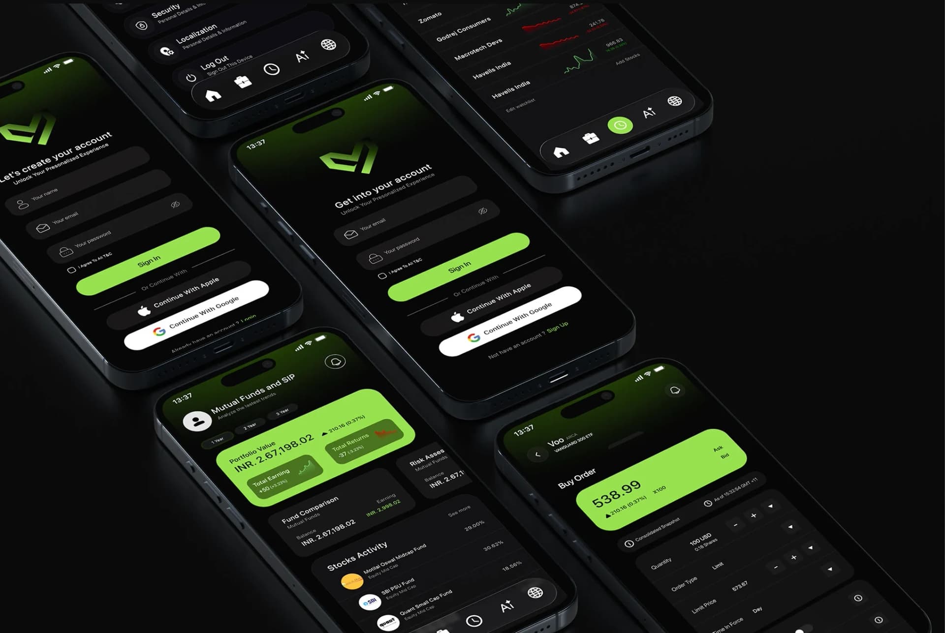
- Account creation and sign-in share one layout, with the product's action in green and Apple and Google in white
Five destinations, instruments one level down.
The information architecture has five branches — Home, Portfolio, Watchlist, A.I. and News — matching the five destinations in the bottom navigation. Trading, deposits, withdrawals, search, notifications and every instrument type live under Home; Portfolio splits into stocks, SIPs and mutual funds. A new asset class becomes a new child of Home, not a new tab.
One dashboard for every instrument.
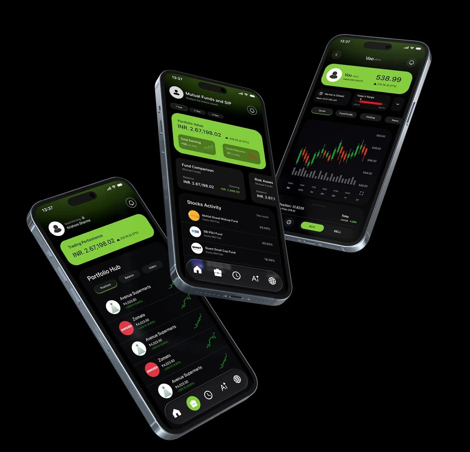
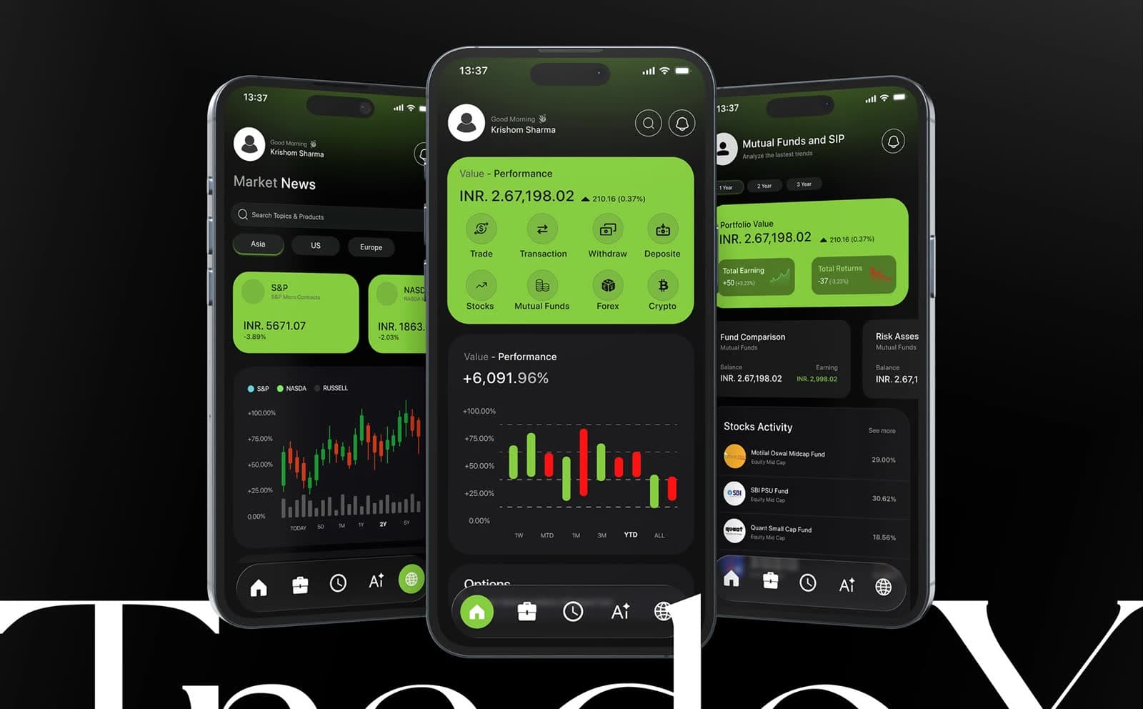
Home leads with portfolio value and performance, with quick actions for every instrument inside the same card. Mutual funds and SIPs get their own portfolio view with earnings, returns, fund comparison and risk. Instrument screens pair a candlestick chart with buy and sell, and the buy order ticket follows the same card and colour rules as everything before it.
What the work clarified.
Setting the architecture and the system first meant the later screens — mutual funds, instrument detail, the order ticket — were assembled from existing parts rather than invented, which is where the product's consistency comes from.
What the case study does not yet show is the assistant as a designed conversation: A.I. is defined at the level of navigation (new chat, chat history), and designing how it explains a recommendation without pushing one would be the next step.
Built from one system.
TradeX runs on a deliberately small system: two neutrals for depth, white for text, and a green and a red that carry all the meaning. On a black ground those two colours read instantly, which is what lets a dense financial screen stay calm.
Palette and typeface are from the published TradeX style guide; the information architecture is from the project's own IA map. Components are rebuilt from the published screens. Spacing and radius values were not published and are not guessed at here.
01 — Foundations
Colour, type and shape — the decisions every component inherits.
Published palette
Charcoal Black
#171717
Cards and panels
Iron Gray
#252525
Chips, inputs, raised surfaces
White
#FFFFFF
Text and third-party buttons
Green
#84CC3C
Brand accent, primary actions, gains
Red
#FF0000
Losses and negative change only
Typography
Interface & figures
SF Pro Display
INR 2,67,198.02 ▲ 210.16 (0.37%)
Apple's system typeface — it renders as SF Pro on Apple devices, and as the platform's sans elsewhere.
02 — Components
Rebuilt from the TradeX screens and tokens — the parts every screen is assembled from.
Value - Performance
Value card with quick actions
The anchor of Home: portfolio value, signed change, and every instrument one tap away. It is the only accent-filled surface on the screen, so it is always read first.
Change indicators
Value first, then change. Gains in green with an arrow; losses in red with a minus — direction survives without colour.
Value - Performance
+6,091.96%
Performance chart
Gains and losses on one baseline in the two semantic colours, with dashed gridlines and a percentage axis. Timeframes switch by weight, so the controls never compete with the data.
Filters
Region chips on Iron Gray gain an accent outline when selected.
Activity list
Name and category on the left, return right-aligned, so figures can be compared straight down the column.
Search & header actions
Search as a full-width pill in the content, search and notifications as outlined icon buttons in the header.
Buttons
The product's own action in the accent; third-party sign-in in white, so the two are never confused.
Five destinations · Home active
Bottom navigation
A floating pill with five icon destinations, one per branch of the information architecture. The active item is the only filled icon, on an accent circle.
03 — Patterns
How the components combine into behaviour that repeats across the product.
Architecture mirrored in navigation
Five branches in the information architecture and five destinations in the bar. Instruments live one level down, under Home, so a new asset class adds a child rather than a tab.
Value, then change — everywhere
The home card, the mutual-fund portfolio and the instrument screen all state a figure the same way: the value, then its signed change and percentage beside it. Once someone has read one card, they can read all of them.
Reading first, acting second
Home leads with what a person opens the app to check — value, change, performance — and keeps actions inside that card rather than above it. Buy and sell appear on the instrument screen, at the moment someone is ready to commit.
One layout for getting in
Create account and sign in share a layout: mark, fields, a green primary action, then Apple and Google in white. The two flows are recognisably the same screen, which removes a moment of doubt at the very start.
04 — Applied system
The same foundations and components carried across real screens — none of them designed in isolation.